How to make App Store screenshots, step by step
From the first screen in the simulator to the upload: which sizes are required, what order the images go in, how to write headlines, and what App Store Connect rejects.
By Dominik Ginting, who builds ASODeck · Updated
In short
- Up to ten screenshots per size and language. Depending on orientation, search results show the first one to three when there is no app preview. The first images do most of the work.
- Required for iPhone: 1206 × 2622 pixels (6.3″). If the app runs on iPad, add 2064 × 2752 pixels (13″). Smaller devices get the images scaled down.
- The images show the app in use. Title art, a login page or a splash screen alone is not enough (guideline 2.3.3); text and image overlays are allowed.
- PNG or JPEG, without transparency.
- Google Play takes two to eight images per device type, between 320 and 3840 pixels, with the long side at most twice the short side.
1. Settle the sizes
For the App Store you need one format per device class, not one per device. For iPhone that is 1206 × 2622 pixels today; App Store Connect calls the slot “iPhone with Dynamic Island (medium display)”. For iPad it is 2064 × 2752 pixels (13″). All smaller devices get the images scaled down.
If you want separate images on the large iPhones, add 1320 × 2868. The aspect ratio is almost the same, so the same layout carries both. From April 2027, the foldable iPhone Duo adds two sizes of its own; see the guide iPhone Duo screenshots.
| Store | Format | Pixels | When |
|---|---|---|---|
| App Store | iPhone 6.3″ | 1206 × 2622 | required for iPhone |
| App Store | iPhone 6.9″ | 1320 × 2868 | optional, large iPhones |
| App Store | iPad 13″ | 2064 × 2752 | if the app comes to iPad |
| Google Play | Phone | 1080 × 1920 | common, 320 to 3840 allowed |
| Google Play | Feature graphic | 1024 × 500 | required in the listing |
All 26 sizes for both stores, with aspect ratio and a copy button, are on the screenshot sizes page.
2. Settle the story
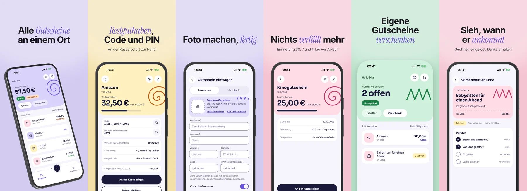
Apple advises leading with your strongest features and ordering the images so that together they tell a story that reflects how someone would use the app. The first image decides whether people keep swiping. A sequence that almost always works:
- Hook: the main benefit in one sentence. No logo, no “Welcome”.
- Problem or solution: what the app makes easier, shown on the real screen.
- Features: one per image, ones people actually use.
- Trust: a rating or a user quote, once the number carries weight.
Where do the themes come from? Ideally from your reviews: what users praise and your store description does not mention belongs up front. The free review analysis shows this for any app, with quotes and stars.
3. Capture the screens
- Capture in the simulator, not on your own phone: the right size, no notifications, no private data.
- Sample data instead of real data: names, photos and numbers you are allowed to show.
- No dialog in the image, no loading spinner, no empty state unless it is the point.
- The same state in every language, so the sets match.
In the simulator, one command cleans up the status bar and a second one captures the screen:
xcrun simctl status_bar booted override --time 9:41 --batteryState charged --batteryLevel 100
xcrun simctl io booted screenshot 01-home.png
4. Write the headlines
One headline per image, one statement per headline. It has to stay legible at the small size of the search results.
- Short: three to six words almost always carry.
- Specific instead of general: “One sentence every evening” instead of “The best journal app”. Apple advises against filling a whole image with general praise or a call to action.
- Emphasize the one word that carries the statement, not the first one out of habit.
- A subline only where the headline alone does not do it.
- Write each language anew instead of only translating. Apple recommends localizing screenshots for every market.
5. Design
- One style for the whole set: same typeface, same colors, so the images read as a row.
- Variety in the layout: large device, cropped device, two devices. Nobody reads ten identical images to the end.
- Lift out what matters: a card or number from the screen, enlarged next to the device.
- Check the contrast: white text on a light gradient disappears in search.
For single images in a device, say for your own website, the free mockup generator is enough.
6. Export and upload
- Export at exactly the pixel dimensions of the slot. App Store Connect rejects an image of the wrong size; often it just went into the wrong slot.
- PNG or JPEG, without an alpha channel.
- In App Store Connect the slots are named by device type: 1206 × 2622 belongs to “iPhone with Dynamic Island (medium display)”, 1320 × 2868 to “iPhone with Dynamic Island (large display)”.
- After uploading, check the order and repeat for every language.
- For Google Play, upload the images in the store listing of the Play Console, plus the 1024 × 500 feature graphic.
Sources
Everything here follows Apple's own pages, read on November 5, 2026.